
When a user lands on your homepage, they form an opinion about your brand in less than a second. Long before they read your headline, evaluate your services, or click a button, their brain processes visual cues, and chief among them is color.
Color psychology is the study of how hues influence human behavior and perception. In modern web design, your palette does far more than just look pretty; it communicates your brand’s values, builds subconscious trust, and guides visitors toward conversion. Whether you are building a brand from scratch or consulting with experts in website design San Diego to revamp your online presence, selecting the right palette is one of the most critical decisions you will make.
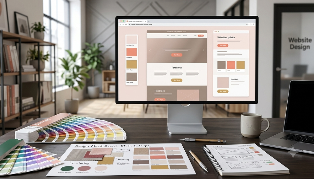
Why Color Psychology Matters in Web Design
Colors trigger immediate emotional and physical responses. A high-energy red can raise a visitor’s heart rate and foster urgency, while a serene ocean blue creates an immediate feeling of stability and safety.
When your website colors align with your brand purpose, visitors feel instantly comfortable. When there is a mismatch such as a law firm using bright neon yellow or a high-energy gym using pale lavender it creates cognitive dissonance that quietly drives potential customers away.
10 Website Color Combinations & The Emotions They Invoke
To help you curate the perfect atmosphere for your digital storefront, here are 10 effective color psychology combinations used across modern web design:
Key Insight: A DIY site acts like an online brochure, while a professionally designed site acts like a 24/7 sales engine.
1. Navy Blue & Slate Gray
- Emotions Invoked: Trust, Security, Professionalism, Authority
- Best For: Corporate agencies, finance, law firms, and tech platforms. Navy blue establishes rock-solid dependability, while slate gray adds modern sophistication without feeling overwhelming.
2. Vibrant Orange & Charcoal
- Emotions Invoked: Energy, Innovation, Enthusiasm, Accessibility
- Best For: Tech startups, fitness brands, and creative platforms. Orange provides a playful spark of enthusiasm, while charcoal anchors the design with sleek structure.
3. Forest Green & Warm Sand
- Emotions Invoked: Sustainability, Health, Growth, Balance
- Best For: Eco-friendly products, organic goods, wellness coaches, and outdoor brands. Green invokes nature and renewal, paired with warm sand tones for an inviting, grounded vibe.
4. Royal Purple & Soft Gold
- Emotions Invoked: Luxury, Creativity, Elegance, Prestige
- Best For: High-end boutique services, creative agencies, and premium product lines. Purple has historical ties to royalty and wisdom, while gold accents add an undeniable touch of luxury.
5. Sunny Yellow & Bright Teal
- Emotions Invoked: Optimism, Joy, Freshness, Curiosity
- Best For: Educational platforms, children's products, and lifestyle blogs. Yellow stimulates happiness and mental clarity, while teal keeps the visual tone balanced and modern.
6. Soft Blush Pink & Warm Taupe
- Emotions Invoked: Calm, Nurturing, Modern Elegance, Comfort
- Best For: Skincare lines, interior design studios, and lifestyle brands. Pink conveys gentle warmth and care, complemented beautifully by grounding taupe neutrals.
7. Crimson Red & Crisp White
- Emotions Invoked: Passion, Urgency, Excitement, Boldness
- Best For: Restaurants, entertainment, and e-commerce clearance pages. Red commands immediate visual attention and stimulates action, while clean white space prevents visual clutter.
8. Sky Blue & Mint Green
- Emotions Invoked: Tranquility, Wellness, Harmony, Cleanliness
- Best For: Healthcare providers, spas, medical practices, and relaxation apps. This combination mimics clear skies and fresh air, instilling a sense of peace and mental clarity.
9. Onyx Black & Metallic Gold
- Emotions Invoked: Exclusivity, Power, Sophistication, High Status
- Best For: Luxury real estate, high-end jewelry, and VIP membership sites. Black creates high visual contrast and mystery, while metallic gold elevates the brand to high-tier status.
10. Earthy Terracotta & Cream
-
Emotions Invoked: Authenticity, Comfort, Craftsmanship, Warmth
-
Best For: Artisanal bakeries, handmade goods, cafes, and rustic hospitality. Terracotta offers a cozy, handcrafted feel, while cream softens the overall layout for a welcoming visitor experience.
That’s where we come in. Based in San Diego, WebmasterDeveloper proudly serves local businesses and private clients worldwide. We offer dependable, high-quality, and affordable web services tailored to your unique goals. Let us take the stress out of setup or managing your website—reach out today!